Color in interior design theory.
Color is one of the most important elements of interior design. It can be used to create a mood, evoke an emotion, or simply make a space more visually appealing. Color theory is the study of how colors interact with each other and how they can be used to create a desired effect.
Color theory is the study of how colors interact with each other and how they can be combined to create pleasing and effective color schemes. It involves understanding the properties of color, such as hue, saturation, and brightness, as well as the emotions and associations that different colors can evoke. By mastering the basics of color theory, you can create beautiful and functional interior spaces that enhance your mood and well-being.


Pro Tip of the Day: Gather color samples and create a mood or inspiration board to represent your color scheme so you can get a feel for the aesthetic you are wanting to create.
Color basics in interior design begin with primary colors. There are three primary colors: red, yellow, and blue. When these colors are mixed together, they create secondary colors: orange, green, and purple. Tertiary colors are created by mixing a primary color with a secondary color.
In addition to hue, color also has three other properties: value, saturation, and temperature. Value refers to the lightness or darkness of a color. Saturation refers to the intensity of a color. Temperature refers to whether a color is warm or cool.

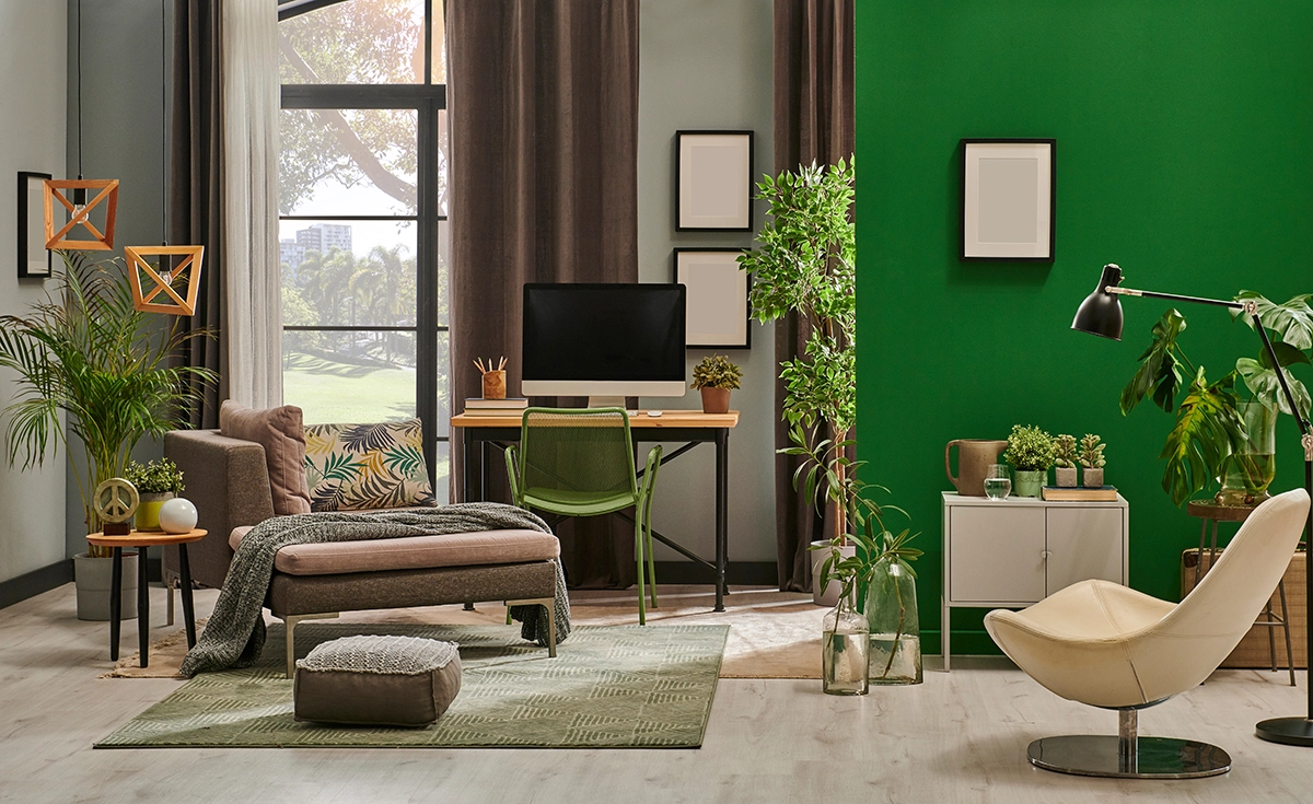
Warm colors, such as red, orange, and yellow, are associated with energy, passion, and excitement. Cool colors, such as blue, green, and purple, are associated with calmness, peace, and relaxation.
When choosing colors for an interior space, it is important to consider the function of the space, the desired mood, and the overall style of the home. For example, a bedroom should be a relaxing space, so it is best to use cool colors. A living room, on the other hand, is a more active space, so it is better to use warm colors.
It is also important to consider the size of the space when choosing colors. Light colors make a space feel larger, while dark colors make a space feel smaller.
Eco-Friendly Tip of the Day: Eco-friendly paint options have come a long way in recent years, with many low- and zero-VOC (volatile organic compound) paints now available. These paints not only reduce harmful emissions, but also offer great coverage, a wide range of beautiful colors, and easy application. Natural paints are also a popular option for those looking for a more sustainable and non-toxic alternative. Plus, these eco-friendly paints often come in a variety of finishes to suit any project.
Interior Color Can Create a Variety of Effects

Interior color design ideas can be used to create a variety of effects in an interior space. It can be used to:
Create a mood: Warm colors can create a cozy and inviting mood, while cool colors can create a more sophisticated and elegant mood.
Define space: Color can be used to define different areas of a room, such as the living area, dining area, and kitchen.
Highlight architectural features: Color can be used to highlight architectural features, such as fireplaces, windows, and doorways.

Make a statement: Color can be used to make a statement in a room. For example, a bold color can be used to create a focal point in a room.
When used effectively, color can be a powerful tool in interior design. It can be used to create a space that is both visually appealing and functional.
How to use color to create a focal point in a room

One way to use color to create a focal point in a room is to choose a bold, bright color for one wall or a piece of furniture. This will draw the eye and create a sense of interest and excitement in the space.
Another option is to use contrasting colors, such as pairing a bright red with a cool blue, to create a dynamic and visually striking effect. Additionally, you can use color to highlight a specific area or object in the room, such as a piece of artwork or a unique architectural feature.
How to use color to create a stylish and modern look

To create a stylish and modern look with color in interior design, start by choosing a neutral base color for the walls and larger furniture pieces. Then, add pops of bold, bright colors in accents like throw pillows, rugs, and artwork.
Consider using color-blocking techniques, where you group together colors in geometric shapes or patterns, for a trendy and modern look. Don’t be afraid to mix and match colors, but be sure to balance them out with plenty of neutrals to avoid overwhelming the space.
Here are some additional tips for using color in interior design:
- Use a color wheel to help you choose colors that complement each other.
- Don’t be afraid to experiment with different color combinations.
- Consider the size of the space when choosing colors.
- Use color to create a mood or atmosphere.

- Highlight architectural features with color.
- Make a statement with color.
With a little planning and creativity, you can use color to create a beautiful and stylish interior space.
How is white used in interior spaces?

White is considered a versatile and timeless color in interior design. It can create a sense of calm and purity, and make a space feel larger and brighter. It can be used as a dominant color or as an accent to complement other colors in a room. It is also considered a neutral aesthetic. White also makes a great backdrop for a neutral palette.


White makes a great backdrop for more natural decor such as the use of warm wood.
Neutrals are Timeless
Neutral colors are a great way to create a stylish and sophisticated look in any interior space. Neutrals are a great way to create a modern interior that will stand the test of time.


Neutrals are great with darker wall colors. Geometrics add depth and dimension to a neutral palette.
However, it can be tricky to know how to mix neutrals in a way that is both visually interesting and cohesive. As in the photos above neutrals can be used in an assortment of ways.
Use different shades of the same neutral color. This will create a sense of depth and interest without adding any other colors to the space. For example, you could paint the walls a light gray and then use a darker gray for the furniture and accessories.


Neutrals are also great with lighter wall colors.
Use different textures. Texture can add visual interest to a room without adding any other colors. For example, you could use a textured rug, throw pillows, or curtains in a neutral color scheme.
Use natural elements. Natural elements, such as plants, wood, and stone, can add a touch of warmth and sophistication to a neutral room.
Use lighting. Lighting can also be used to create a sense of depth and interest in a neutral room. For example, you could use recessed lighting, table lamps, or floor lamps to create different layers of light in the space.

Greenery and natural light make spaces feel more natural.
Add patterns. Patterns can also add visual interest without adding any other colors. For example, you could use a patterned rug, throw pillows, or curtains in a neutral color scheme.
By following these tips, you can create a stylish and sophisticated neutral room that is both visually interesting and calming.
Here are some additional tips for using neutrals:
Consider the overall style of the room. If you’re going for a modern look, you might choose clean lines and geometric shapes. If you’re going for a more traditional look, you might choose softer curves and organic shapes.
Don’t be afraid to add pops of color. If you want to add a bit of color to your neutral room, you can do so by adding pops of color in the form of accessories, artwork, or furniture. This is a great way to add personality and style to your space without overwhelming it.
Have fun with it! There are no rules when it comes to decorating with neutrals. So experiment with different combinations and see what you like best.


Have fun with it!
Using Color to Make Spaces Feel Larger
How to use color to make your space feel larger.
Neutral colors are colors that are not too bright or too dark. They are often used as a base color in interior design, and they can be used to create a variety of looks. Some popular neutral colors include white, black, gray, and beige.
Here are some ways to use color to make your space feel larger:
Use light colors: Light colors reflect more light, which can make a space feel larger and brighter. If you have a small space, consider painting the walls a light color. You can also use light-colored furniture and accessories to create a more open and airy feel.

Use vertical stripes: Vertical stripes can make a space feel taller. If you have a low ceiling, consider painting the walls with vertical stripes. You can also use vertical stripes on curtains, rugs, and other accessories.
Use mirrors: Mirrors can reflect light and make a space feel larger. If you have a small space, consider adding mirrors to the walls. You can also use mirrors on furniture and other accessories.
Use furniture with light legs: Furniture with light legs can make a space feel more open and airy. If you have a small space, consider using furniture with light legs. You can also use furniture with light legs to create a sense of flow in the space.
Use open shelving: Open shelving can make a space feel larger and more airy. If you have a small space, consider using open shelving instead of closed cabinets. You can also use open shelving to display your favorite belongings.

Use a focal point: A focal point can help to draw the eye and make a space feel larger. If you have a small space, consider creating a focal point with a fireplace, a large piece of art, or a bookshelf.
By following these tips, you can use color and furniture to make your space feel larger and more inviting.

Neutral colors are a great choice for small spaces because they can make the space feel larger and brighter. They are also a versatile choice that can be used to create a variety of looks. If you are looking for a way to make your interior spaces feel larger consider using neutral colors.
Color Psychology in Interior Design
Color plays a vital role in interior design theory.
Color is a powerful tool in interior design, capable of transforming a space and influencing the emotions and behaviors of those who inhabit it. Understanding the psychology of color can help you create a harmonious and inviting environment that reflects your personal style and enhances your well-being. In this guide, we’ll explore the basics of color theory and how to use it effectively in your interior design projects.
The impact of color on mood.
Color has a powerful emotional impact on our mood and behavior. Warm colors like red, orange, and yellow can evoke feelings of energy, excitement, and happiness, while cool colors like blue, green, and purple can create a sense of calmness, relaxation, and tranquility.
Neutral colors like white, gray, and beige can provide a sense of balance and stability. Understanding the emotional impact of color can help you choose the right colors for your interior design projects and create spaces that promote positive emotions and well-being.
How to use color to make your space feel more cozy.

Color is a powerful tool in interior design that can be used to create a desired atmosphere in a space. For example, if you want to create a cozy and intimate atmosphere in a bedroom, you might choose warm, muted colors like deep reds, browns, and oranges.
If you want to create a calm and relaxing atmosphere in a living room, you might choose cool, muted colors like blues, greens, and grays. By understanding the emotional impact of color, you can use it to create the desired mood and atmosphere in any space.
Choosing the right colors for your home.
When it comes to interior design, color combinations, and contrasts can make a big impact on the overall look and feel of a space. Complementary colors, which are opposite each other on the color wheel, can create a bold and vibrant look.
Analogous colors, which are next to each other on the color wheel, can create a harmonious and cohesive look. And monochromatic color schemes, which use different shades and tints of the same color, can create a sophisticated and elegant look. It’s important to consider the desired mood and atmosphere of the space when choosing color combinations and contrasts.
How to Use Color to Create a Specific Atmosphere

Color psychology is the study of how colors can affect human behavior and emotions. When it comes to interior design, understanding color psychology can help you create a space that evokes the desired mood and atmosphere. For example, blue is often associated with calmness and relaxation, making it a good choice for bedrooms or bathrooms.
Yellow is associated with happiness and energy, making it a good choice for kitchens or home offices. Red is associated with passion and excitement, making it a good choice for dining rooms or living rooms. By applying color psychology to your interior design, you can create a space that not only looks great but also feels great to be in.
Complimentary Colors in Interior Design
Complementary colors are colors that are located directly opposite each other on the color wheel. When placed next to each other, they create a high-contrast effect that can be both dramatic and visually stimulating.
In interior design, complementary colors can be used to create a variety of looks, from bold and modern to elegant and sophisticated. They can also be used to create a sense of energy and excitement in a space or to provide a relaxing and calming atmosphere.
Here are some tips for using complementary colors in interior design:
Use them sparingly: Complementary colors can be very intense, so it’s important to use them sparingly. If you’re not sure how to use them, start by using them as accents, such as with pillows, artwork, or throw blankets.
Use them in equal amounts: If you want to create a more dramatic effect, you can use complementary colors in equal amounts. However, this can be overwhelming, so it’s important to balance the colors with neutrals.
Use them in different shades: You can also use complementary colors in different shades to create a more subtle effect. For example, you could use a bright red and a deep blue, or a light green and a dark purple.

Use them to create a focal point: Complementary colors can be used to create a focal point in a room. For example, you could paint one wall a bright color, or use complementary colors in your furniture and accessories.
When used effectively, complementary colors can add a touch of glamour and sophistication to any interior space.
Here are some examples of complementary color schemes that you can use in your home:
Red and green: This is a classic complementary color scheme that is often used for Christmas decorations. However, it can also be used to create a more modern and sophisticated look.
Blue and orange: This is another bold and vibrant complementary color scheme. It can be used to create a fun and playful space or to add a touch of color to a neutral-colored room.

Yellow and purple: This is a more subtle complementary color scheme that can be used to create a calming and relaxing atmosphere.
Complementary Colors can Tone Each Other Down
Complementary colors are colors that are located directly opposite each other on the color wheel. When placed next to each other, they create a high-contrast effect that can be both dramatic and visually stimulating. However, complementary colors can also be used to create a more subdued look by mixing them together.
When complementary colors are mixed together, they create a new color that is located in the middle of the color wheel. This new color is called a tertiary color. Tertiary colors are often muted and less intense than the original complementary colors.
For example, when red and green are mixed together, they create a new color called yellow-orange. Yellow-orange is a warm color that is less intense than either red or green.


By mixing complementary colors together, you can create a more subdued and harmonious look in your home. This is a great way to use complementary colors if you want to add a touch of color to your space without making it too overwhelming.
Here are some tips for mixing complementary colors in interior design:
Start with a small amount of each color: When you’re first mixing complementary colors, it’s best to start with a small amount of each color. This will help you to avoid creating a color that is too dark or too bright.
Add more color as needed: Once you’ve mixed a small amount of each color, you can add more color as needed. This will help you to create the desired shade of tertiary color.
Experiment with different combinations: There are no right or wrong answers when it comes to mixing complementary colors. Experiment with different combinations until you find a look that you like.
With a little experimentation, you can use complementary colors to create a beautiful and stylish interior space.
Monochromatic color schemes
Monochromatic colors can be adapted to any style.

Monochromatic colors and color schemes are popular choices for home interiors because they are simple, elegant, and easy to achieve. A monochromatic color scheme is created by using different shades, tints, and tones of a single color. This can be done with any color, but it is often used with neutral colors such as white, black, and gray.
There are many benefits to using monochromatic color schemes in home interiors. One of the biggest benefits is that they create a sense of harmony and unity in your space. When all of the colors in a room are related, it creates a more cohesive and visually appealing look. Monochromatic color schemes can also make a room feel larger and brighter. This is because light colors reflect more light, which can make a space feel more open and airy.

Another benefit of monochromatic color schemes is that they are very versatile. They can be used in any room in the home, and they can be adapted to suit any style. For example, a monochromatic color scheme can be used to create a sleek and modern look in a living room, or a cozy and inviting look in a bedroom.
Here are some ideas for using monochromatic color schemes in home interiors:
If you are thinking about using a monochromatic color scheme in your home, there are a few things to keep in mind. First, it is important to choose a color that you love. This is because you will be seeing this color a lot, so it is important to choose something that you find aesthetically pleasing.
Second, you can add interest to a monochromatic color scheme by using different textures and materials. For example, you could use a smooth fabric for the sofa and a textured rug for the floor. Finally, you can add pops of color to a monochromatic color scheme with accessories such as pillows, artwork, and flowers.

Living room: A monochromatic color scheme can be used to create a sleek and modern look in a living room. Choose a neutral color such as white or gray as the base color, and then add pops of color with accessories such as pillows, artwork, and flowers.
Bedroom: A monochromatic color scheme can be used to create a cozy and inviting look in a bedroom. Choose a warm color such as blue or green as the base color, and then add pops of color with accessories such as bedding, curtains, and rugs.

Kitchen: A monochromatic color scheme can be used to create a clean and modern look in a kitchen. Choose a light color such as white or beige as the base color, and then add pops of color with accessories such as appliances, utensils, and cookware.
Bathroom: A monochromatic color scheme can be used to create a luxurious and spa-like feel in a bathroom. Choose a cool color such as blue or green as the base color, and then add pops of color with accessories such as towels, rugs, and artwork.
Monochromatic color schemes are a versatile and stylish way to decorate your home. With a little planning, you can create a beautiful and inviting space that is perfect for you.
Here are some tips on how to use color to tone down a dominating color in a room:

Add neutrals: One way to tone down a dominating color is to add neutrals to the space. Neutrals are colors that are not too bright or too dark, such as white, black, gray, and beige. Adding neutrals to a room will help to balance out the dominating color and make it less overpowering.
Use different shades of the dominating color: Another way to tone down a dominating color is to use different shades of that color. For example, if you have a room that is painted a bright red, you could add some furniture and accessories that are a more muted shade of red, such as terracotta or brick red. This will help to create a more cohesive look and make the red less jarring.
Add pops of color: If you don’t want to completely tone down the dominating color, you can add pops of color to the space. Pops of color are small accents that add a touch of brightness and personality to a room. You can add pops of color with pillows, artwork, rugs, and other accessories.


Add furniture pieces: As in the photo above incorporating wallpaper with additional colors including white brings the yellow down a notch. Also, the neutral sofa color grounds the space while toning down the yellow as well. As in the second photo colorful accent furniture pieces can add interest to a room and break up the monotony of colors as well.
Use patterns: Patterns can also be used to tone down a dominating color. Patterns can be found in fabrics, rugs, wallpaper, and other materials. When choosing patterns, it’s important to choose patterns that have a calming or relaxing effect.
Change the lighting: The lighting in a room can also affect the way that color is perceived. If you have a room that is painted a dominating color, you can try changing the lighting to make the color less intense. For example, you could add some dimmer switches or change the light bulbs to a warmer color temperature.
By following these tips, you can use color to tone down a dominating color in a room and create a more balanced and harmonious space.
Here are some additional tips:

Consider the size of the room: If the room is small, you’ll want to use lighter colors to make it feel larger. If the room is large, you can use darker colors to create a more intimate space.
Consider the style of the room: If the room is modern, you’ll want to use clean lines and geometric shapes. If the room is traditional, you’ll want to use softer curves and natural materials.
Consider the mood that you want to create: If you want to create a relaxing space, you’ll want to use calming colors such as blues and greens. If you want to create an energetic space, you’ll want to use bright colors such as reds and oranges.
With a little planning, you can use color to create a beautiful and inviting space that is perfect for you.
Using Pops of Color


There are many ways to add pops of color to your home decor. Here are a few ideas:
Use accent pieces including furniture. Color is an essential element in interior design, and accent furniture and decor can be used to add pops of color and visual interest to a space. These pieces are intentionally chosen to stand out from the rest of the decor, creating a focal point and adding depth and dimension to the overall design. Whether it’s a brightly colored accent chair or a bold piece of artwork, accent pieces can transform a room and make it feel more vibrant and dynamic.
Paint one wall. This is a great way to add a big dose of color to a room without being too overwhelming. Choose a color that you love and that will complement the rest of your décor.
Add colorful pillows and throws. This is a simple way to add some color and personality to your sofa or bed. Choose pillows and throws in different colors, patterns, and textures to create a fun and inviting space.
Hang colorful artwork. Artwork is a great way to add color and style to any room. Choose pieces that you love and that will make a statement.

Use colorful accessories. There are many ways to add color with accessories, such as lamps, vases, rugs, and baskets. Choose accessories that are in your favorite colors and that will add a touch of personality to your space.
Bring in the outdoors. Plants are a great way to add color and life to your home. Choose plants in different colors and sizes to create a lush and inviting space.
Use seasonal decor. During the holidays, you can add pops of color with seasonal décors, such as Christmas ornaments, Easter eggs, and Halloween decorations.
When choosing colors, it’s important to consider the overall style of your home and the colors that you already have in your décor. You can use a color wheel to help you choose complementary colors. If you’re not sure what colors you like, you can start by looking at nature for inspiration.
With a little creativity, you can easily add pops of color to your home décor and create a space that’s both stylish and inviting.


Here are some additional tips for adding pops of color to your home décor:
Use a variety of colors. Don’t be afraid to mix and match different colors. This will help to create a more dynamic and interesting space.

Use different shades of the same color. This is a great way to create a cohesive look without being too overwhelming.
Don’t be afraid to use bold colors. Bold colors can add a lot of personality to a space. Just be sure to use them in moderation so that the room doesn’t become too busy.

Pay attention to the placement of color. Where you place color in a room can make a big difference. For example, using bright colors on the walls can make a room feel larger.
How to Use Color to Add Personality to Your Home
One way to add personality to your home is through the use of color. Consider using bold, bright colors in accent pieces such as throw pillows, rugs, and curtains. You can also paint an accent wall in a bold color or use colorful artwork to add interest to a room. Don’t be afraid to mix and match colors, but be sure to choose a color scheme that complements the overall style of your home.

Don’t be afraid to experiment. The best way to find out what works for you is to experiment. Try different colors and placements until you find a look that you love.
In Conclusion, Color in Interior Design
Color in interior design is an essential element because it can affect mood, create atmosphere, and even influence behavior. Different colors can evoke different emotions and feelings and can be used to create a sense of harmony or contrast in a space. Color can also be used to highlight architectural features or to create focal points in a room.
Read about color trends for 2023 here.

How to Use Color – Shop here Now!
As an Amazon Associate, IDJ earns from qualifying purchases.
barbie decoratebarbie decoratingbarbie decorationsbarbie house smallbarbie surferbold colorscalming colorscolorcolor combinationcolor palettecolor trendscontrastdecorating vinyl recordsdecor junkiediydiy home decorgreeneryhome decorhome decor color trends 2023home decor ideashome decor inspirationhome decor styleshome interior designIDJ Interior Designs Junkieinterior designInterior design junkieinteriordesignsjunkieinteriordesignsjunkie.cominterior design trendslightingliving roommid century modernmodern interior designMood boards for interior designorganizescalescale and proportionScandinavianstatement piecessurfer barbietexturetimelesstypes of home decor styleswall artwhat interior design
Color is an essential element in interior design because it can affect mood, emotions, and even physical reactions. Different colors can create different atmospheres and convey different messages, making it a powerful tool for designers to use in creating a space that is both functional and aesthetically pleasing.